


During the Spring 2018 semester, Monday is Climate Day. To make it even more thematic, I’m focusing on various ways of visualizing climate and weather data. Today’s topic: the long-term decline of Arctic sea ice since 1979.
Scientists have long known that global warming would cascade throughout the Earth’s climate system and lead to many indirect effects of carbon dioxide accumulation in the atmosphere. However, the rapid decline in the Arctic’s sea ice cover was one of the earlier indications that climate change was not just in our future, but also our present. The classic way to present this decline is with two figures: a map and a graph (Figure 1).

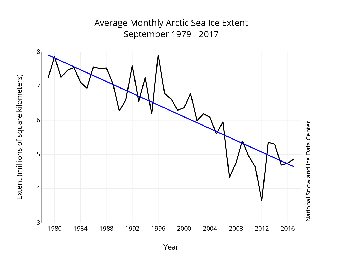
Figure 1. (top) Map of average September Arctic sea ice extent for 2017 (compared to median extent for 1981-2010) and (bottom) time series (with linear trend) of September Arctic sea ice extent for 1979 to 2017. (National Snow and Ice Data Center)
Why September? September is the month that Arctic sea ice reaches its minimum extent. Each winter, sea ice expands out of the Arctic Ocean into lower latitudes like Hudson Bay and the Bering Sea. Each summer, it retreats back to the central Arctic Ocean. September is the end of summer, so any sea ice leftover at that minimum is part of the “perennial” or “permanent” sea ice cover. The rest is just temporary.
These two plots are helpful scientific tools. For instance, you can see in the map that on average from 1981-2010, there was no open water passage through the Arctic. In 2017 it was possible to send any sea-worthy vessel through. On the graph, you can see how in the year 1996, there still was no clear climate change signal. But 20 years of decline later, the trend is obvious.
However, this version of showing sea ice can be hard to wrap your head around in terms of scale. How big is 8 million square kilometers anyway? This is where Option #2 comes in.
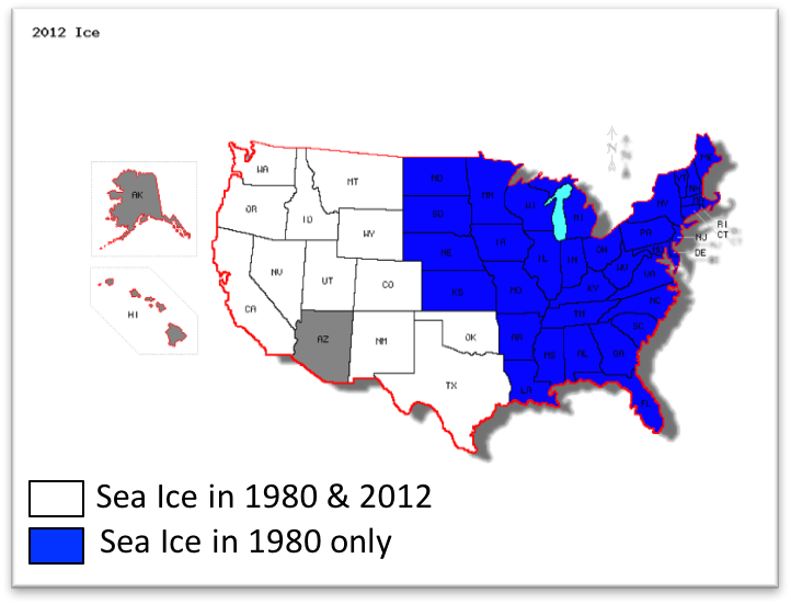
Figure 2. Arctic sea ice loss from 1980 to 2012 compared to the size of the United States. (Courtesy of Walt Meier)
In the Figure 2 on the left, white states are equal to the area of sea ice that existed in both 1980 and 2012. Blue states are equal to the area that had sea ice in 1980 but not in 2012. In other words, blue states are equal in area to the sea ice loss between 1980 and 2012. This figure, by Dr. Walt Meier, helps put sea ice loss into perspective, because that’s not just an analogy; those areas of the states are equivalent to the areas of summer sea ice. So it’s not only that there’s been more than a 50% reduction; a vast area of ocean half the size of the lower 48 used to be covered with ice year-round, but now is seasonally open.
But this still isn’t very flashy, so some people have gone the route of animation. Option #3 is animating the maps of Arctic sea ice extent that come from the National Snow and Ice Data Center (Figure 1). This maintains the basic science data approach of Option #1 but adds the animated aspect to help your eyes compare the shape of sea ice extent, not just a dot on a graph. Of course, it can be hard to tell precisely how much sea ice there is in a given year, so this is solely a communication tool, not a research tool.
A more recent type of animation that has become especially popular on Twitter is the “death spiral”. Now we are fully in the “communication” realm because the title assigned to this flavor of animation is using charged language. I personally find the term “death” here excessive. However, putting the alarmism aside, the animation can be informative. Around the edge is every month of the year. The sea ice volume (from the Pan-Arctic Ice Ocean Modeling and Assimilation System, or PIOMAS) is 0 cubic kilometers at the center and 35 million cubic kilometers at the edge. Having the Arctic map in the background is superfluous and possibly distracting, but this is the most recent version of the style I could find.
This animation does a decent job of showing both a) the seasonal cycle of sea ice growth in winter and melt in summer and b) the long-term trend of declining sea ice volume. Note, though, that this is a bit different from measuring sea ice extent. Sea ice extent is a 2-D measure of the surface area of sea ice in the Arctic. Sea ice volume is 3-D; it’s the area times the thickness of sea ice. Thickness is harder to measure than extent, and PIOMAS assimilates model output with a combination of observations from aerial and satellite remote sensing instruments. Although less confidence can be placed in the precision of the numbers, this metric tells the same story as sea ice extent.
I’d love to hear opinions about which type of presentation you like the best!
Of course you’d like the one from UC-Boulder/NOAA…! Me, too! I’ve had students take the “Sea Ice Extent” from the graphics generated in that NSIDC website (http://nsidc.org/data/bist/bist.pl?config=seaice_index) to produce their own MS-XL-based graph of sea ice decline over the last 35-40 years. They get a tiny chance to manipulate data and plot the info in a way that makes the mundane chart a tiny bit more lively, since they participated in its creation. Given their skill level, and whether or not it’s a science-based class, the plots can be made automatic and self-generating, or the students can control the parameters to make their own XL-based graphs of the NSIDC-generated data, tweaking axes to make the data look better (or worse). A good lesson in axis-tweaking to reinforce the point we are attempting to make.