A Wooster Paleontologist visits the Smithsonian’s National Museum of Natural History

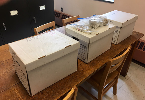
Washington, DC — I have the privilege this semester of being on a research leave from teaching, so I thought I’d report on one of my activities. Without classroom responsibilities I can travel for research opportunities, especially now as the weather in the northeastern US marginally improves. (Despite the sunny view above, it was freezing!)

I visited the Paleobiology Department of the National Museum of Natural History in Washington to examine some particular fossils in the collections, and give a departmental seminar. This is typical for paleontological research, and I’m grateful to the generations of museum scientists who make it possible.

The Collections Manager at the NMNH Paleobiology Department is our own Kathy Hollis (’03). She does such a fine job she’s on a poster board in front of the museum, and she was featured in an excellent Wooster Magazine article on museum science.

Kathy sets me up deep in the fossil collections, endless rows of cabinets. The Paleobiology Department, in fact, has more than 10,000 of these, each with multiple drawers of treasures.

My work is pretty simple at this stage. I find fossils of interest in the collections (most of which I’ve identified from publications) and photograph them for future reference. I use this copy stand, which is the best in the business. (I want one, Department Chair.) The paper tray is filled with lead shot which is useful for positioning specimens at any angle under the camera.

Here’s an example specimen: the ambonychid bivalve Claudeonychia from the Upper Ordovician of the Cincinnatian region. The scale is in centimeters. The dark color is actually an encrusting bryozoan, a story I’ll tell later.

I meet many cool fossils along the way, including this magnificent specimen of Wilsonoceras from Wyoming. It is a nautiloid cephalopod I’ve always wanted to see purely for its name!

Here is the poster for my presentation to the Paleobiology Department. It is a tradition for visiting researchers to present a talk on their work.

This is the Cooper Room where the talks are held. I love its Old School ambiance, and the paleontological history it represents. It is a superb place to present ideas to colleagues in the discipline.

The field season is about to begin for Wooster Earth Scientists, so expect more posts. Again, it is a privilege to have such opportunities.

Posted in Uncategorized | Tagged , , , | Leave a comment

Climate Monday: Climate Change Hot Spots

It’s no secret that global warming does not simply mean more warm days and fewer cold ones. Warming is uneven, with some regions (like the Arctic) warming faster than others. Additionally, warming of the atmosphere and oceans has a cascading effect on other parts of the Earth system, from the amount of ice stored in Greenland to the variability of global wind patterns, to the extent of various habitats. The world is complex, and it the impacts of climate change myriad. With so many changes happening, what places or changes should humans focus adaptation and mitigation efforts? Enter the concept of “climate change hot spots”. Let’s examine three frameworks and how they’re visualized.

Example #1: One of the simplest frameworks for talking about climate change hot spots is to consider places where various physical aspects of the climate are projected to change the most (Kerr 2008). This was the tactic used by a group of climate modelers from the National Center for Atmospheric Research back in 2008.  They ran detailed, regional-scale climate models into the future and looked for a) places with the most change in average temperature and precipitation, and b) places with the most change in the variability of temperature and precipitation (in other words, heat waves, cold snaps, floods, and droughts).  The result was a relative index from low change to high change:

Figure 1: Map of the “relative responsiveness” of the USA and northern Mexico to climate change based on projected changes in temperature and precipitation under a suite of climate models. (Kerr 2008)

The nice thing about this measure is that it’s objective and gives a value of overall impact for everywhere in the lower 48.  It’s limited in it’s utility, though.  For one thing, it only measures temperature and precipitation, omitting related concepts like sea level rise and wildfire frequency/intensity.  It also is a projection of the future, which is problematic both because there’s less certainty about the future and because there are changes already happening that might be more pressing to address.

Example #2: That in mind, another way to define “climate hot spot” is a location that has already changed substantially. The Union of Concerned Scientists (2011) has compiled a map of locations that have “well-documented” changes already occurring. Here’s a snapshot, but the visualization is meant to be an interactive map, not a static image, which is certainly inviting.  The “well-documented” claim is supported by reference lists and descriptions for each event. In other words, these have been researched substantially.  Another interesting point is that the map shows a much broader view of “climate change” than the earlier climate model studies.  Sure, there’s “extreme wet” and “air temperature”, but there’s also “ecosystem” sections and “health” and “food” for people. This is definitely better suited for a broader audience and broader concerns.

Figure 2: Snapshot example of climate hot spots by the Union of Concerned Scientists (2011).

Still, the above example may seem lacking with regard to two elements (and maybe others): First, it is clearly focused on the USA.  There is a data bias, of course — the Union of Concerned Scientists has many American scientists, and many of them study the USA. But it may give the false impression that the USA has more dire situations than the rest of the world.  Second, there is still little sense of risk versus vulnerability.

If we think of climate change as a natural hazard, just like a volcanic eruption or an earthquake or a hurricane, we can talk about both risk and vulnerability of populations.  For example, both the Netherlands and Florida are at great risk of sea level rise, but the Dutch are bettered prepared to adapt to rising seas because of past experience and current cultural, political, and physical infrastructure. The same risk can lead to more or less hardship depending on how vulnerable a place is — and assuming sea level rises about the same in both locations, Florida is likely to have more hardship from sea level rise than the Netherlands.

Example #3: This added concept of vulnerability is used to define “climate hot spots” in yet another way: as locations where “strong physical and ecological effects of climate change come together with large numbers of vulnerable and poor people and communities” (Neumann and Szabo 2016). Their map is still really a measure of risk, not vulnerability, but they use it to help highlight areas with high risk that also have special vulnerability (originally identified by De Souza et al. 2015):

  1. Deltas in Africa and South Asia that have large populations of poorer people. Groundwater extraction and other human activities that make deltas sink can exacerbate the effects of sea level rise.
  2. Semi-arid regions in parts of Africa, South Asia, and Central Asia that may become drier. Again, the lower economic resources in these regions make them more vulnerable.
  3. River basins dependent on glaciers and snowpacks as a water source, especially in the Himalaya, where there are large populations of poorer people.

Figure 3: Climate risks based on three factors: snow-dependence, semi-arid climate, and river deltas. (Neumann and Szabo 2016).

___

Works Cited

De Souza, K., Kituyi, E., Harvey, B. et al.  (2015). Vulnerability to climate change in three hot spots in Africa and Asia: key issues for policy-relevant adaptation and resilience-building research. Reg Environ Change, 15: 747. https://doi.org/10.1007/s10113-015-0755-8

Kerr, R. (2008). Climate Change Hot Spots Mapped Across the United States. Science, 31: 909. http://science.sciencemag.org/content/sci/321/5891/909.full.pdf

Neumann, B. and Szabo, S. (2016). Climate change ‘hotspots’: why they matter and why we should invest in them. The Conversation. Accessed 2 Apr 2018. http://theconversation.com/climate-change-hotspots-why-they-matter-and-why-we-should-invest-in-them-68770

Union of Concerned Scientists (2011). Climate Hot Map. Accessed 2 Apr 2018. http://www.climatehotmap.org

Posted in Uncategorized | Tagged , , , | 3 Comments

Climate Monday: Weather Forecast Maps

The College of Wooster is now back in session for six more weeks, which means we have six more climate visualizations to share this semester. Today is bright, sunny, and quickly approaching 50°F in Indiana, Ohio, and Pennsylvania, but we’re due for a rainy week, so it seemed like a good time to highlight weather forecasts.  In the USA, we see forecasts for our localities frequently.  Maps or descriptions of current and future weather conditions are pervasive throughout the various forms of media, from phone apps to newspapers to radio broadcasts.

Below is the current weather surface according to The Weather Channel.  There’s high pressure currently centered over the northeast — hence the clear skies, but a storm is brewing over the Oklahoma panhandle.  Over the next few days, that low pressure center is going to move eastward and northward, shoving that precipitation you currently see over Missouri along with it and generating more along those fronts as it strengthens.  I like The Weather Channel current surface maps.  They’re neat, colorful, easy to read, and only show the essentials needed to understand the current weather state.  However, they don’t have a similar map for forecasts.

Current US Surface Weather Map

For example, if you go to the “Classic Weather Maps” section of their website, and then scroll down to learn what’s in store for Wednesday, I you see this:

Day 3 Forecast


That not too bad for many people.  Find a city near you, look at the symbol and the high temperature, and you get a good sense of how to dress. However, if you’re halfway between cities shown, like Wooster or the middle of Iowa or Oregon, this map is less helpful. Is is going to rain in Wooster like Cincinnati or just be cloudy like Detroit? Also, there’s a lack of context — there’s no marking of high and low pressure to help give a sense of the atmospheric circulation behind these weather forecasts.  If you’re interested in your locality, you probably want a map that’s zoomed in further, so this national map isn’t helpful. And if you’re a weather geek, you probably want more detail.  So this forecast map may not be what you’re looking for.

Another option is Weather Underground. This website is a bit geekier than The Weather Channel, and it’s especially cool that you can link up your own personal weather station data to their server for free and share it with the world.  Their main forecast map for Wednesday morning (shown below) is dominated by the precipitation.  No cities or cloud/sun symbols are shown, but you probably know where you live and can surmise that a place receiving that light green shade will be cloudy with some showers, whereas the dark green is a sure thing for steady rain at least part of the day.  It’s a little easier to gauge the broader context here, too.  That big band of rain from Texas to upstate New York is a classic signature of a winter storm (yes, “winter”… “extratropical cyclone” is more accurate, but also less commonly said) that’s moved across the Heartland and currently sits in the northeast, a big cold front extending down to the southwest.  But the front isn’t drawn; neither is the low pressure symbol.  There could be more.

Both The Weather Channel and Weather Underground are primarily weather communicators and collectors. They do not actually make the forecasts; rather, they receive forecasts from the National Weather Service (a branch of the National Oceanic and Atmospheric Administration, or NOAA). If you aim for Wednesday from NOAA, you get this map:

For the weather geeks, this is the best map.  It has the precipitation forecast, but it also shows the fronts and the pressure.  The context that can be inferred from other maps is plain and explicit here.  This is definitely not the prettiest map, and if you’re not a weather fan, it might seem pretty cluttered.  However, if you like clutter, check out this forecast map from Unisys:

NAM - US - SL Pres/Prec - 48hr

Personally, I think that is not a nice color scheme, and the number of “Highs” and “Lows” indicated is a tad excessive.  But there’s a lot of data on this map, and that can be useful for analysis even if it fails at communication. In the end, the map you choose likely depends on your personal preference!

Posted in Uncategorized | Tagged , , , , | Leave a comment

A geological and archaeological hike in northeastern Ohio on the last day of winter

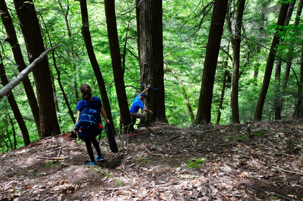
It was a beautiful latest-winter day in Wooster. Nick Wiesenberg had the great idea of taking an afternoon to hike through Pee Wee Hollow, a wooded area of ravines, streams and rocky exposures a few miles northwest of Wooster near the village of Congress. Greg Wiles, his faithful dog Arrow, and I went along. We had an excellent time with no agenda but to explore. Above is Dr. Wiles standing at an outcrop of Lower Carboniferous sandstones, shales and conglomerates making up the Logan Formation. The rocks are similar to those exposed in Spangler Park.

Pee Wee Hollow has three small Native American mounds on an upper plateau. Nick and Arrow are standing on one above. They were excavated in the 1950s, and possibly pillaged long before that. Dr. Nick Kardulias, Dr. Wiles and several others wrote a paper on these mounds. I can quote the abstract entirely: “While a great deal is known about the many earthworks of central and southern Ohio, there is a gap in our data about such features in the northern part of the state. The present report is an effort to bring work on one such site in Wayne County into the literature. The Pee Wee Hollow Mound group consists of three small circular earthen structures and a possible fortification trench on a high bluff overlooking the main stream that drains the county. Systematic excavation by avocational archaeologists in the 1950s revealed the structure of the mounds and retrieved a small assemblage of artifacts, some charcoal, and pockets of red ochre. Recent analysis of the artifacts, coupled with radiocarbon dating, indicates that the site was a location of some local importance from the Late Archaic through the Middle to Late Woodland periods.” (Pennsylvania Archaeologist 84(1):62-75; 2014)

Another of the mounds with Greg and Arrow for scale.
The very fine sandstones of the Logan Formation are especially well exposed in the creek beds. Here are a set of joints our structural geologist Dr. Shelley Judge would appreciate.

There are even some nice Bigfoot field structures. Who knew?We spent most of our time walking up Shade Creek. The creek bed is mostly Logan Formation sandstones.

Greg is standing here on a bedding planes of sandstone with nice ancient ripple marks. Note, by the way, the chunk of ice above his head. Still winter, but not for long.

Here’s a closer view of those ripples.Arrow here contemplates a thick exposure of dark gray shale. Greg found some nice crinoid columns in it, and I found several molds of bivalves.

The more resistant units in the Logan have the best fossils. This slab of very fine sandstone cemented with iron carbonates (a type of siderite concretion) has several internal molds of brachiopods and white calcitic crinoid columns. I described the remarkable preservation of similar crinoids in an earlier series of blog posts.

A nice, uncomplicated walk in a beautiful bit of nature.

Posted in Uncategorized | Tagged , , , , | 1 Comment

Climate Monday: Visualizing the South Asian Monsoon

Last Monday I posted some diagrams, animations, and predictions for El Niño and La Niña. So this week we’ll shift from the Pacific Ocean to the Indian Ocean and check in on the South Asian monsoon.  “Monsoon” is really just another word (of Arabic origin) for “season”, but it’s typically used to describe places with distinct wet and dry seasons caused by a reversal in the dominant regional winds.  There are several factors that impact any monsoon, and in India three important ones are:

  1. The position of the “Intertropical Convergence Zone” (ITCZ)
  2. Land heats up and cools down much more easily than water.
  3. The Himalaya

Although the relative importance of #1 & #2 for South Asia is still debatable, most traditional explanations focus on #2, possibly because it is easier to explain…

Figure 1 is a diagram from Thomas Reuters that depicts the traditional explanation for why monsoons in South Asia (and elsewhere) occur.  The theory goes that:

  1. Land heats up rapidly during summer, while the ocean heats up slowly, so the land surface ends up hotter than the ocean surface.
  2. Hot air is less dense, making it buoyant and likely to rise.
  3. Rising air over land is replaced by cooler ocean air from the southwest, which brings ample moisture with it.
  4. This moisture-bearing air then rises over the Indian sub-continent, cooling down, which causes condensation (cloud formation) and rain, rain, rain.

In winter, this all works in the opposite direction:

  1. Land cools down more quickly than the ocean, so by mid-winter the air over the ocean is warmer.
  2. Rising air is limited to the ocean, and India experiences sinking air instead.
  3. On top of that, winds blow from the northeast over India to replace the air that’s rising to the south, and those northeasterly winds are dry because they come from interior Asia.

In this way, land-sea contrasts help form the monsoon — a seasonal oscillation of southwest to northeast winds and wet to dry seasons.  You’ll see this same description in many animations of the monsoon, too, like this one from NASA:

However, these explanations are incomplete.  Land-sea contrasts are just one factor impacting monsoons.  If they were the only factor, we’d expect monsoons to exist everywhere with a strong warm/cold season and a land/sea boundary. We’d also expect monsoons to be absent anywhere without a strong land/sea contrast or warm/cold season.  Neither of these is true.  The Sahel in Chad is far from any ocean but has a monsoon climate, and islands like the Galápagos and New Caledonia have a monsoon despite being surrounded by the Pacific Ocean.  Meanwhile, places like North Carolina and France have strong winter/summer contrasts in temperature but no clear wet/dry season, and even coastal places like San Francisco, USA or Luanda, Angola, which have distinct wet/dry seasons, lack the wind reversal characteristic of a monsoon.

Figure 2: Seasonal shifts in the Intertropical Convergence Zone (ITCZ) — the main tropical rain belt. (Image Credit: Mats Halldin)

The South Asian monsoon cannot be understood without another aspect: the Intertropical Convergence Zone (ITCZ). This is a zone of hot, rising air throughout the tropics.  This air cools at it rises, causing condensation and rainfall.  It occurs primarily because the tropics receive more direct sunlight than anywhere else in the world, and because of that solar control, the ITCZ drifts northward in May through July and southward in November through January, following the Sun.  It happens over land and water alike, but the shifting tends to be more prominent over land areas, which can heat up and cool down more quickly. In other words, when you combine the concept of land-sea contrast with the concept of the ITCZ, its understandable that the monsoon in South Asian is particularly strong. Both are working in concert.

You can see the progression of the monsoon northward across India throughout June and July (Figure 3).  It’s mostly a south-to-north progression, but also largely east to west.  Again, this is due to a convergence of factors, not just land/ocean heating contrasts.

Figure 3: Progress of the 2016 summer monsoon in India compared to normal. (It was a late monsoon year.) Source: India Meteorological Department.

However, the South Asian monsoon also would not be nearly so strong without the Himalaya — the highest mountains in the world.  These mountains are so imposing that they effectively block advancement of winds blowing from the southwest.  Warm, moist air from the Indian Ocean stalls out in the Himalayan foothills, making Bangladesh the wettest place on Earth.

This video and animation from JeetoBharat, an Indian mentoring and test-prep organization, does a better job incorporating the multiple facets of the South Asian monsoon:

Posted in Uncategorized | Tagged , , , , | Leave a comment

Climate Monday: Visualizing El Niño and La Niña

Continuing our survey of climate and weather visualizations, this week we have a few ways of visualizing El Niño and La Niña, which are two flavors of the El Niño-Southern Oscillation (or ENSO).  This is a relevant topic for this winter, because the world is currently experiencing a La Niña episode.

The best way to fully grasp the El Niño Southern Oscillation is probably through animations that can give a 3-dimensional perspective, because the whole system depends on interactions between the ocean and atmosphere throughout the entire equatorial Pacific Ocean — which stretches for a little under 1/2 of the entire Equator.  It’s a complicated system, and using just words is inadequate.  Here’s one example from Keith Meldahl, a professor at MiraCosta College:

If you prefer a British accent and a more formal presentation, here’s an animation from the UK Met Office:

To summarize, these animations are showing how ENSO works and how it impacts precipitation in the tropical Pacific. Normally, ocean currents and wind at the surface both bring air and water  from east to west, pulling water away from South America.  This keeps the coast of Peru and Ecuador cooler and drier than you might expect, because cold water from the south and from deep in the ocean moves in to replace the water being pushed to the west.  Meanwhile, Indonesia, Papua New Guinea, and Oceania receive ample rain from the warm currents and warm winds.  This hints at a key concept in hydrology and meteorology: air that starts out cold is unlikely to provide much rain, but air that starts out warm and then rises and cools? That’s a rainmaker. During an El Niño event, the winds and ocean currents are weaker, so there’s less pushing of the warm air to the west, and the area where rain occurs drifts to the east.  During a La Niña event, the winds and currents are stronger, so there’s more pushing to the west, and the area where rain occurs drifts west.

That’s great for visualizing the physics, but to see what’s going on right now, a great place to visit is the National Oceanic and Atmospheric Administration’s ENSO website. The easiest way to measure whether we’re in neutral conditions, El Niño, or La Niña is to measure the temperature of the ocean surface (a.k.a. “sea surface temperature” or SST) using satellites. When El Niño occurs, there’s weaker currents and less upwelling of cold water off the coast of Peru, so the sea surface is warmer than normal.  When La Niña occurs, there’s more upwelling of cold water than normal, and the sea surface is colder than normal.  We’re are in a modest La Niña right now, and it’s starting to weaken. Here’s the data from January 2018:

This map shows how sea surface temperatures along the Equator compared to normal for January of 2018. Blue color shows that the sea surface was colder than normal along the Equator — a La Niña event (from NOAA). Data come from a combination of satellites managed by the USA, Japan, and Europe.

The last question we might consider is: Does this have any impact on the USA?  The answer is: some impact, but it’s indirect.  El Niño and La Niña influence the location of the jet streams, narrow regions of strong winds that direct most of our weather in the USA. The jet streams bring rain. The USA is mostly dominated by the polar jet stream, but during El Niño years, the polar jet stream is pushed to the north, and a secondary jet stream develops in the south — often right through Arizona, Texas, and Florida. So the southern tier of the USA tends to be wetter during El Niño events and drier during La Niña events.  La Niña events are often some of the coldest in the northern Great Plains of the US and Canada, and El Niño some of the warmest.

For Ohio, La Niña events actually end up being a little wetter because the polar jet stream is more often sitting right over us (like it was nearly all of last week!). Note, ENSO has only a weak to moderate influence in much of the USA, but it is part of what shapes our winter weather!

Typical winter weather patterns for North America during La Niña and El Niño events. (from NOAA)

More El Niño:

An overview from the UK Met Office

The 2015-2016 El Niño Event (by ECMWF)

El Niño for Kids (by NASA)


Posted in Uncategorized | Tagged , , , , | Leave a comment

A warm February afternoon in Spangler Park

Wooster, Ohio — The weather today was extraordinary. It reached at least 70°F in our little Ohio town, which must be near a record. Greg Wiles, Nick Wiesenberg and I took advantage of the warmth and sunlight to hike through Spangler Park. I think the day should be memorialized with a brief blog post. Greg and I are on research leaves this semester, so it is easy for us to break away from our computers to take jaunts like this. (Sorry, Meagen, Shelley, Alex and Karen!)

Above is a familiar exposure to most Wooster Geologists. It is an exposure of glacial sediments visited by dozens of department field trips. Recently a slump block descended across the face of it, exposing new material. Nick is standing on the block, and Greg’s dog Arrow is watching at a prudent distance.

Chloe Wallace (’17) posted this nice description of this outcrop two years ago:

This photo is taken from across Rathburn Run, from the point bar. This outcrop is much younger in age, from the last time Ohio was affected by glaciation. During the Last Glacial Maximum, specifically the Pleistocene, glacial debris flows deposited the bottom section of the outcrop. The sediment is characterized by a fining upwards sequence and has two scales of support. Some areas of the deposit are composed of large grains within a matrix-support due to debris flow. Other areas of the deposit are composed of sandy conglomerate rock that is grain supported. Overall the sediment is poorly sorted and contains glacial erratics within the sediment, including boulders made of gneiss, granite, and some sedimentary rocks.

A channel cut through the original glacial debris flow deposit and was eventually filled in by wind-blown silt, also known as loess. Loess is characteristically different from the glacial deposit at the bottom of the outcrop. Loess breaks in sheets, which causes it to have steep angles. Overall, the history of this outcrop is that approximately 15,000 years ago debris flow events deposited the glacial sediment at the bottom of the outcrop, then a channel cut into the deposit and that channel eventually filled with eolian (wind-blown) silt.

Classic geology on a beautiful day.

Posted in Uncategorized | Tagged , , | 1 Comment

Climate Monday: NASA Animations of Ice Sheet Loss

Two weeks ago on Climate Monday, I highlighted some different visualizations of sea ice loss in the Arctic. Monitoring the sea ice regime is important for knowing the limits of human navigation, resource extraction, and other activities in the Arctic, but the subsequent decline in land ice has a much broader impact on humans because melting land ice leads to sea level rise. You may have seen time lapses of retreating glaciers before, like this time lapse of Columbia Glacier in Alaska. That is dramatic and provocative, but in the long term, the two most important sources of ice melt are Greenland and Antarctica.

Artistic depiction of the GRACE satellites from the NASA Earth Observatory.

One of the main ways we monitor the loss of mass from these ice sheets is the GRACE satellites. GRACE (Gravity Recovery and Climate Experiment) is a pair of satellites launched in 2002 that follow each other around the world about 120 km (90 miles) apart. What they actually measure are very slight variations in that distance between them, and this is indirectly but accurately measures the regional gravitational pull of the Earth.  The stronger Earth’s gravitational pull, the faster the satellites will orbit.  Since they’re 90 miles apart, when the first satellite passes over an area with greater mass (and therefore a stronger gravitational pull), it goes a little faster and the distance between the two satellites expands.  Then, when the second one passes over the same spot, it catches back up and shrinks the distance. That variation in distance tells NASA scientists how much mass comprises various regions of the Earth.  It can’t detect small changes like constructing a new building or cutting down a stand of trees.  But it can detect large changes like long-term groundwater withdrawal or melting ice sheets.

NASA has put together two animations that show this system at work in Greenland and Antarctica. The beauty of these animations is that they pair a time series of mass loss with a map of the decline in the height of the ice sheet. (Be careful; the change in “height” of the ice sheet is measure in “water equivalent”, which means they’re reporting the loss as liquid water, not ice.  This is done because the density of water is less variable than the density of ice.  Using water makes it easier to compare different areas.) In Greenland, you can see the seasonal cycle of accumulation in winter and melt in summer, but the overall decline is also obvious.  Most of the ice sheet has lost mass, but the greatest loss has been at a few really large glacial outlets. Overall, there’s about 0.8 mm (0.03 inches) per year of sea level rise coming from Greenland right now. That’s not huge, but combined with mountain glaciers, Antarctica, and thermal expansion, it’s been around 3 mm (0.12 inches) each year overall since GRACE was launched.

Although not very important right now, Antarctica is the most important mass of ice for the long haul. If the entire Antarctic ice sheet melted, it would add roughly 9 times as much water to the oceans as Greenland would (roughly 60 m versus 7 m, respectively). That isn’t going to happen under current projections — but by 2100 we could very well see a meter. The animation starts in 2002 and shows how much mass loss occurred through 2016. The average loss is 125 gigatons per year, which sounds like a lot.  It is, to be sure, but it’s only a small amount of sea level rise — about 0.35 mm (0.014 inches) per year.  So right now, Greenland is still the bigger contributor. The really cool thing about the animation is that you can see that current mass loss from Antarctica is restricted to just a few places.  The Antarctica Peninsula is one place, which makes sense; it’s the farthest north and warmest area of Antarctica. But another is in “West Antarctica” (on the left of the map). This area is losing mass fast, especially Thwaites Glacier and Pine Island Glacier. But overall, Antarctica is contributing only very a small about of melt to the oceans compared to its potential.

Posted in Uncategorized | Tagged , , , , | Leave a comment

Climate Monday: NERSC Surface Pressure Observations

Although we often care more about the temperature and precipitation when we talk about weather, the most basic weather observation we can make is atmospheric pressure. Atmospheric pressure is really a measure of how much air is above you. That might not seem like a big deal, but clear skies are characterized by high pressure (e.g., 1020 hectopascals, or hPa) whereas storms are characterized by low pressure (e.g., 980 hPa). So air pressure was an early method of short-term weather prediction. If the pressure is dropping, a storm will likely follow. And once the pressure starts rising again, the worst is likely over. That’s useful. What’s also useful is that air pressure is easy to measure. Evangelista Torricelli made a functional mercury barometer back in the 1600s.  Today, air pressure is still one of the basic variables used to characterize weather and make forecasts.

The surface pressure network as of January 1851 (beginning of the animation).

Today’s climate visualization is 160 years of weather observations by Philip Brohan.  It’s a gargantuan 13-minute animation of all surface pressure observations dating back to 1851 that are currently freely available to the scientific community. Every frame shows all measurements for a 3-day period. That is precise! And some of the patterns are fascinating. At the beginning of the record, most of the data are from ship observations. The only land stations are in North America and Europe, and even those are limited.  Throughout the late 1800s, the USA, Europe, Russia, and Australia all see increasing coverage. At sea, changes in ship technology is apparent, as individual ships make a greater range of observations as time progresses.  The opening of the Suez and Panama Canals is also obvious. Several countries show abrupt increases in the density of their pressure networks. Japan suddenly has ample coverage in 1901; Germany increases density in the 1930s that far exceeds France. During WWII, India suddenly has a broad network, and Germany’s network reaches a peak in coverage that suddenly drops after the war. eastern China’s network becomes large in the 1950s, falls back in the 1960s, and then stays dense for good in the 1970s. Finally, the breakup of the USSR in 1991 was accompanied by a major decrease in surface pressure observations.

I have not dug too deep into the history of these observations, but this animation is a good window into how human technology and society can impact the availability of scientific data.  We are still reliant on shipping lanes to this day for pressure observations, and we know more about the North Atlantic than the South Pacific.  For more information about the data source, check out Internatonal Surface Pressure Databank.

The surface pressure network as of March 1970 (9:45 in the animation).


Posted in Uncategorized | Tagged , , | Leave a comment

Climate Monday: Four Ways to Visualize Arctic Sea Ice Decline

During the Spring 2018 semester, Monday is Climate Day.  To make it even more thematic, I’m focusing on various ways of visualizing climate and weather data.  Today’s topic: the long-term decline of Arctic sea ice since 1979.

Scientists have long known that global warming would cascade throughout the Earth’s climate system and lead to many indirect effects of carbon dioxide accumulation in the atmosphere. However, the rapid decline in the Arctic’s sea ice cover was one of the earlier indications that climate change was not just in our future, but also our present. The classic way to present this decline is with two figures: a map and a graph (Figure 1).

Figure 1. (top) Map of average September Arctic sea ice extent for 2017 (compared to median extent for 1981-2010) and (bottom) time series (with linear trend) of September Arctic sea ice extent for 1979 to 2017. (National Snow and Ice Data Center)

Why September?  September is the month that Arctic sea ice reaches its minimum extent. Each winter, sea ice expands out of the Arctic Ocean into lower latitudes like Hudson Bay and the Bering Sea.  Each summer, it retreats back to the central Arctic Ocean. September is the end of summer, so any sea ice leftover at that minimum is part of the “perennial” or “permanent” sea ice cover. The rest is just temporary.

These two plots are helpful scientific tools.  For instance, you can see in the map that on average from 1981-2010, there was no open water passage through the Arctic.  In 2017 it was possible to send any sea-worthy vessel through. On the graph, you can see how in the year 1996, there still was no clear climate change signal.  But 20 years of decline later, the trend is obvious.

However, this version of showing sea ice can be hard to wrap your head around in terms of scale.  How big is 8 million square kilometers anyway? This is where Option #2 comes in.

Figure 2. Arctic sea ice loss from 1980 to 2012 compared to the size of the United States. (Courtesy of Walt Meier)

In the Figure 2 on the left, white states are equal to the area of sea ice that existed in both 1980 and 2012. Blue states are equal to the area that had sea ice in 1980 but not in 2012. In other words, blue states are equal in area to the sea ice loss between 1980 and 2012.  This figure, by Dr. Walt Meier, helps put sea ice loss into perspective, because that’s not just an analogy; those areas of the states are equivalent to the areas of summer sea ice. So it’s not only that there’s been more than a 50% reduction; a vast area of ocean half the size of the lower 48 used to be covered with ice year-round, but now is seasonally open.

But this still isn’t very flashy, so some people have gone the route of animation. Option #3 is animating the maps of Arctic sea ice extent that come from the National Snow and Ice Data Center (Figure 1). This maintains the basic science data approach of Option #1 but adds the animated aspect to help your eyes compare the shape of sea ice extent, not just a dot on a graph.  Of course, it can be hard to tell precisely how much sea ice there is in a given year, so this is solely a communication tool, not a research tool.

A more recent type of animation that has become especially popular on Twitter is the “death spiral”.  Now we are fully in the “communication” realm because the title assigned to this flavor of animation is using charged language.  I personally find the term “death” here excessive.  However, putting the alarmism aside, the animation can be informative.  Around the edge is every month of the year.  The sea ice volume (from the Pan-Arctic Ice Ocean Modeling and Assimilation System, or PIOMAS) is 0 cubic kilometers at the center and 35 million cubic kilometers at the edge. Having the Arctic map in the background is superfluous and possibly distracting, but this is the most recent version of the style I could find.

This animation does a decent job of showing both a) the seasonal cycle of sea ice growth in winter and melt in summer and b) the long-term trend of declining sea ice volume. Note, though, that this is a bit different from measuring sea ice extent.  Sea ice extent is a 2-D measure of the surface area of sea ice in the Arctic. Sea ice volume is 3-D; it’s the area times the thickness of sea ice.  Thickness is harder to measure than extent, and PIOMAS assimilates model output with a combination of observations from aerial and satellite remote sensing instruments. Although less confidence can be placed in the precision of the numbers, this metric tells the same story as sea ice extent.

I’d love to hear opinions about which type of presentation you like the best!

Posted in Uncategorized | 1 Comment