The following post is courtesy of Anna Cooke (’20), who worked with Dr. Alex Crawford through Wooster’s Sophomore Research Program this summer
In the heat of Ohio’s summer, it’s been a small bit of relief to turn my attention to Alaska; or more specifically, to rain on snow events in Alaska. A rain on snow event is pretty much exactly what it sounds like. It occurs when rain falls on a preexisting snowpack. For this to happen, the temperature must rise above freezing during a precipitation event. If the temperature then falls below freezing following the event, the result is a layer of ice on the surface of, in, or underneath the snowpack.
But why should those of us who live in the continental interior care?
Rain on snow, hereby referred to as ROS, has some interesting and possibly devastating effects. One such effect is on caribou populations. The diet of Alaskan caribou varies, but something that most caribou have in common is the dependence on ground foliage, such as lichens, as a winter food source (Joly et al., 2015). ROS is dangerous for caribou because of the possibility that the resulting ice layers will block this food source. Nutritional stress caused by ROS can lead to declining birth rates and calf weights. At the most extreme, mass die-offs can result from starvation (Mallory and Boyce, 2018). The resulting population decline or emigration of caribou impacts the hunters who rely on the caribou as a food source.

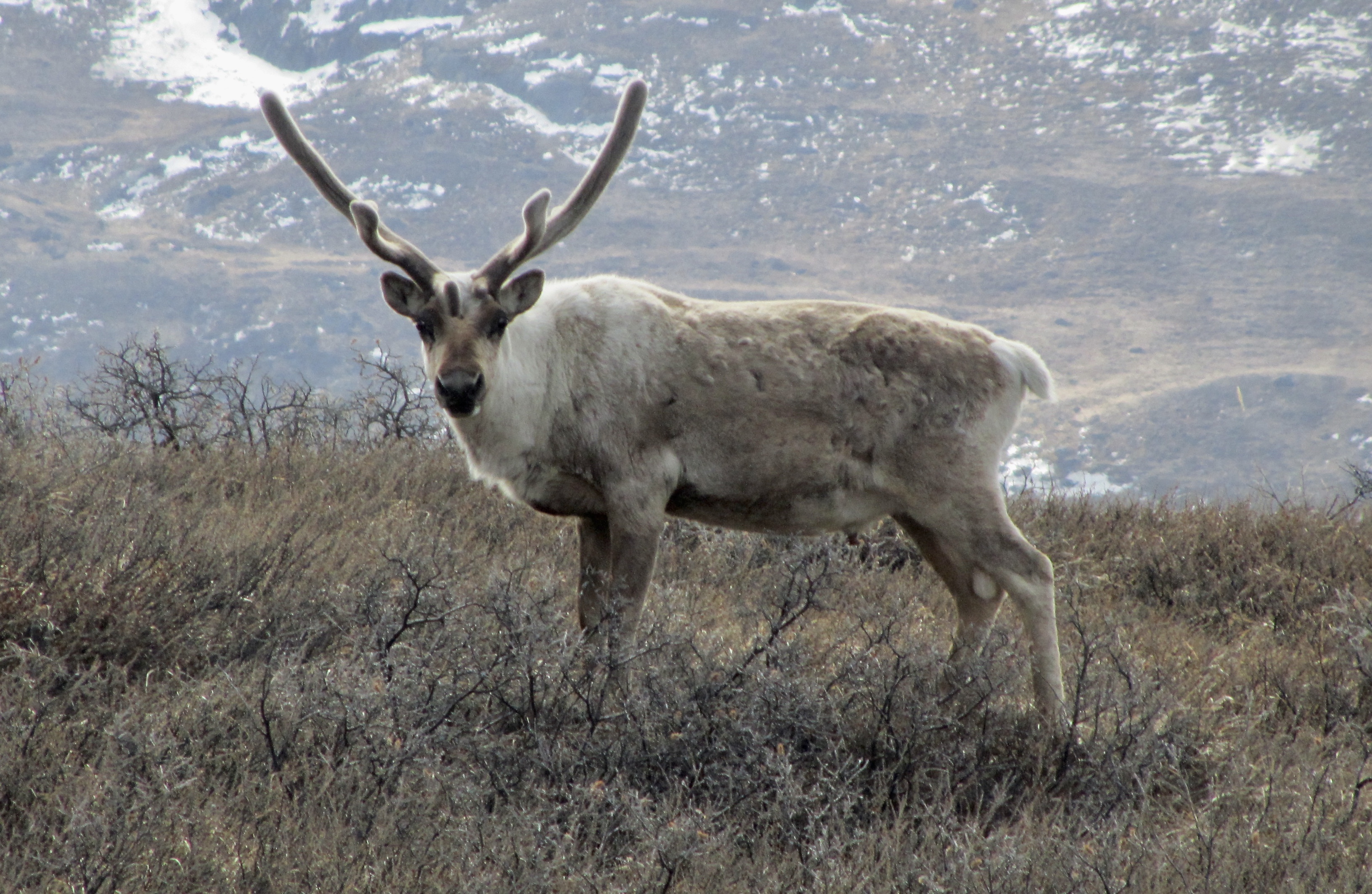
Fig 1: Caribou photo courtesy of Dr. Karen Alley.
Other impacts of ROS include the shutdown of airports and loss of revenue from tourism, and permafrost degradation. If enough rain infiltrates through the snowpack to its base, when it refreezes, the latent heat that is released will maintain a soil temperature of 0 degrees Celsius when it should be much colder. The resulting warming of subsurface temperatures could destabilize permafrost systems, causing slope instability and avalanches (Rennert et al., 2009).
Identifying ROS Events
If we want to mitigate the effects of ROS events, it is important that we understand where, when, and how often they occur. To do this, ROS can be identified and analyzed using climate models, satellite data, and observational data from weather stations. One difficulty in identifying ROS events is that no one agrees on just what a ROS event is. Some people define it as 3 mm of rain falling on 5 mm of snow water equivalent, or SWE, which is the amount of water present if the snowpack were to be melted. Others use different thresholds than 3 and 5 mm. Some use measures such as over 12 continuous hours of precipitation visually classified as drizzle and greater than 0.0 mm.
Despite this variation all identification strategies share one limitation: none keep track of refreezing after the precipitation event. This is an issue because ROS without refreezing does not have the same impacts as ROS followed by freezing, and if we are interested in the events most likely to have strong effects, refreezing is imperative.
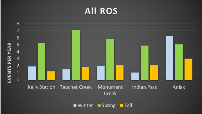
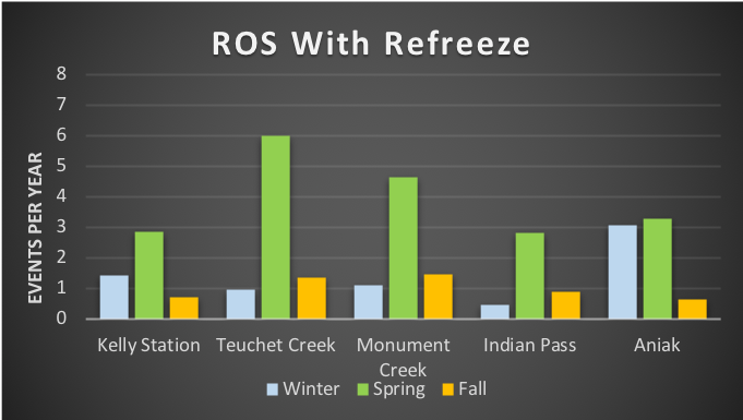
I experimented with different identification strategies and thresholds trying to find a method that was restrictive enough that I wasn’t overcounting the number of events, but not so stringent that I was undercounting. The graphs below show the average number of events per year divided by season at five different weather stations in Alaska when counting events as 0.1 inches of precipitation on 0.1 inches of SWE, or 1 inch of snow depth for stations where SWE is not available. The first graph shows the total number of ROS events counted. The second graph shows the number of ROS events followed by refreezing. In all cases, fewer events are counted when refreezing is accounted for, and in several cases no more than half of ROS events are followed by refreezing. Thus, it’s likely that many studies are overestimating the number of impactful ROS events.
Results


Fig 2: Number of rain on snow (ROS) events per year by season for (top) all events and (bottom) events followed by refreezing.
As you can see from the graph above, most ROS events seem to occur in the spring, which is defined as March, April, and May. ROS functions a bit differently depending on the season. In the fall, the temperatures are often warm enough for rain to occur, but there may not be a snowpack for the rain to fall on. In the winter, the limiting factor is not snowpack, but rain, since the precipitation that falls is more likely to be snow. In the spring, the presence of a snowpack and the increase of the temperature to allow for rain are likely. However, a refreezing event is less likely. Moreover, even if there is refreezing afterwards, the number of days that the temperature remains below freezing is likely to be lower than the number of days for a winter event.
As such, events in each season pose different threats to caribou herds. In the fall, healthy caribou which have spent the summer with plentiful food access are more likely to be weakened than killed off. However, major winter events in which the snowpack is frozen over for weeks afterwards are more likely to decimate populations. Events in the spring are also dangerous because, even though the ice is not likely to inhibit foliage access for more than one or two weeks at a time, caribou may already be weakened from harsh winters.
Since there are so many factors to take into account in the study of ROS events, more research is necessary, especially since the frequency with which events occur is likely to increase with global warming. There are ways that we can mitigate the effects of ROS on wildlife and human populations, but only if we can understand its causes and effects. The research done this summer is piece of a larger story, and it was a pleasure to add this piece to the puzzle.

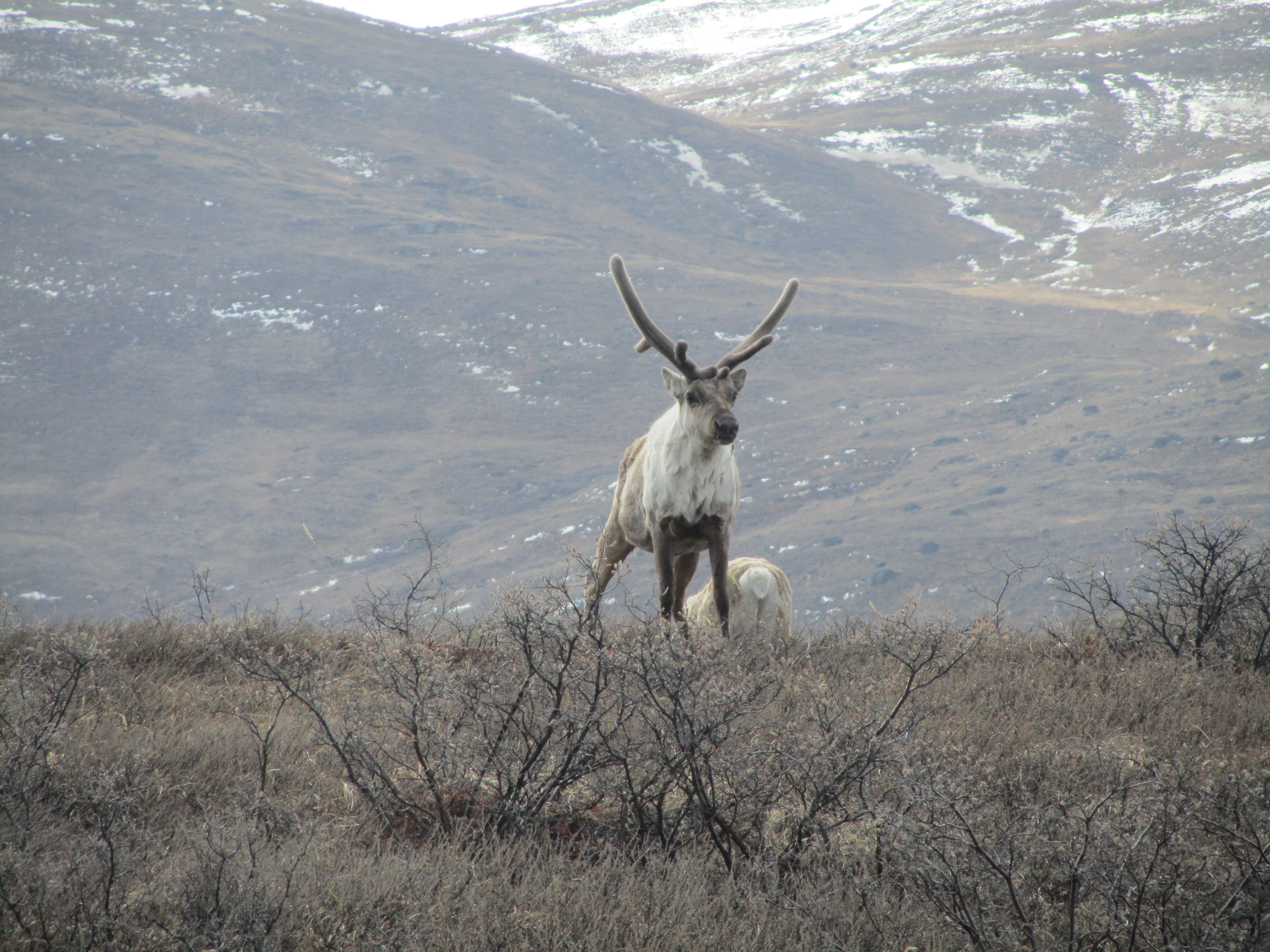
Fig 3: Caribou photo courtesy of Dr. Karen Alley
Works Cited:
- Joly, Kyle, Samuel K. Wasser, and Rebecca Booth. 2015. Non-Invasive Assessment of the Interrelationships of Diet, Pregnancy Rate, Group Composition, and Physiological and Nutritional Stress of Barren-Ground Caribou in Late Winter. PLoS One, 10 (6): 1-13 (DOI: 10.1371/journal.pone.0127586).
- Mallory, Conor D. and Mark S. Boyce. 2018. Observed and predicted effects of climate change on Arctic caribou and reindeer. Environmental Reviews, 26 (1): 13-25.
- Putkonen, J., T.C. Grenfell, K. Rennert, C. Bitz, P. Jacobson, and D. Russell. 2009. Rain on Snow: Little Understood Killer in the North.EOS,90 (26): 221-222.
- Rennert, Kevin J., Gerard Roe, Jaako Putkonen, and Cecilia M. Bitz, 2009. Soil Thermal and Ecological Impacts of Rain on Snow Events in the Circumpolar Arctic. Journal of Climate,22: 2302- 2314 (DOI: 10.1175/2008JCLI2117.1).


 Tartu, Estonia– Bill Ausich and I arrived exhausted but safely in this old university city last evening. Fortunately we had this gorgeous Sunday to recover and adjust to the seven-hour time difference. We explored the neighborhood around our hotel (“V-Spa Hotell”). This is the city hall building. We had dinner under the umbrellas. It is hot here, with “extreme high temperature” warnings and forest fires to the north.
 This statue memorializes the Estonian War of Independence from the Russian Empire (and soon to be Soviet Union) in 1918-1920. If you follow the link you’ll see how complicated these events were. This year Estonia is celebrating a century since it declared independence. Tragically, it has had less than fifty years of actual independence because of Soviet, then German, then Soviet successive occupations.