Although we often care more about the temperature and precipitation when we talk about weather, the most basic weather observation we can make is atmospheric pressure. Atmospheric pressure is really a measure of how much air is above you. That might not seem like a big deal, but clear skies are characterized by high pressure (e.g., 1020 hectopascals, or hPa) whereas storms are characterized by low pressure (e.g., 980 hPa). So air pressure was an early method of short-term weather prediction. If the pressure is dropping, a storm will likely follow. And once the pressure starts rising again, the worst is likely over. That’s useful. What’s also useful is that air pressure is easy to measure. Evangelista Torricelli made a functional mercury barometer back in the 1600s. Today, air pressure is still one of the basic variables used to characterize weather and make forecasts.
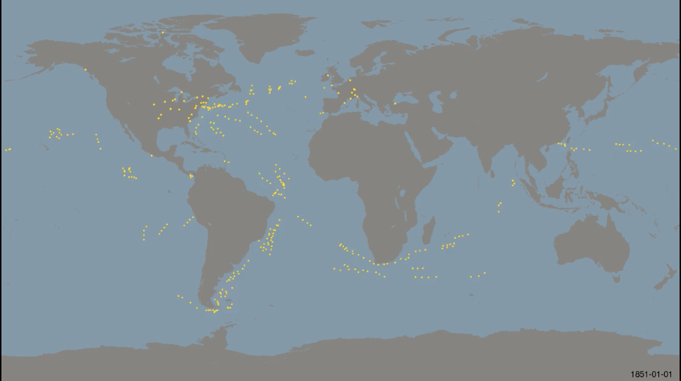
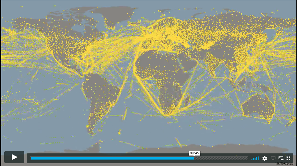
Today’s climate visualization is 160 years of weather observations by Philip Brohan. It’s a gargantuan 13-minute animation of all surface pressure observations dating back to 1851 that are currently freely available to the scientific community. Every frame shows all measurements for a 3-day period. That is precise! And some of the patterns are fascinating. At the beginning of the record, most of the data are from ship observations. The only land stations are in North America and Europe, and even those are limited. Throughout the late 1800s, the USA, Europe, Russia, and Australia all see increasing coverage. At sea, changes in ship technology is apparent, as individual ships make a greater range of observations as time progresses. The opening of the Suez and Panama Canals is also obvious. Several countries show abrupt increases in the density of their pressure networks. Japan suddenly has ample coverage in 1901; Germany increases density in the 1930s that far exceeds France. During WWII, India suddenly has a broad network, and Germany’s network reaches a peak in coverage that suddenly drops after the war. eastern China’s network becomes large in the 1950s, falls back in the 1960s, and then stays dense for good in the 1970s. Finally, the breakup of the USSR in 1991 was accompanied by a major decrease in surface pressure observations.
I have not dug too deep into the history of these observations, but this animation is a good window into how human technology and society can impact the availability of scientific data. We are still reliant on shipping lanes to this day for pressure observations, and we know more about the North Atlantic than the South Pacific. For more information about the data source, check out Internatonal Surface Pressure Databank.


