


While Dr. Wilson is on leave and taking a hiatus from his acclaimed “Fossil of the Week” series, the Department of Geology decided to fill the void with something completely different: Climate Monday. For 15 weeks in the Spring 2018 semester, I am going to highlight one animation, graphic, or online tool that helps visualize some aspect of the climate system. Some are about weather, some about climate. Most are about the atmosphere, but the ocean comes into play as well.
I want to start with a bang, so first up is my favorite weather animation: Cameron Beccario’s “Earth”. A screenshot below is from just after New Years’, when a nor’easter was blasting the northeast USA and cold Arctic air was surging southward over the Midwest. (Wooster, OH is in the middle of the little green circle.) This is a beautiful image on its own. The swirling convergence of wind around the nor’easter turns red to indicate the high wind speeds. The easterly Trade Winds blowing off Africa are clearly defined. Two additional winter storms can be seen by the clustered wind streamers and red coloring in the North Atlantic and North Pacific Oceans, although neither is as tight and powerful as the East Coast blizzard.
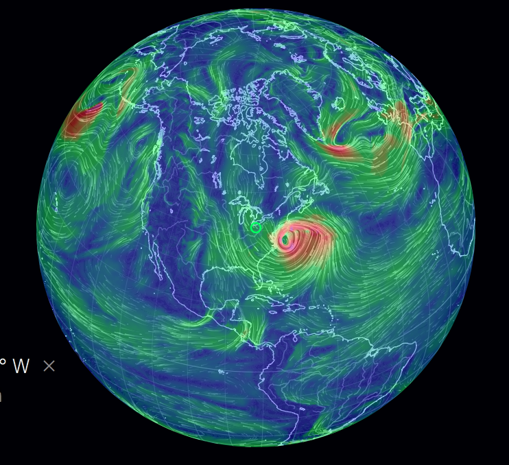
Screenshot of wind animation for 5 January 2018, from Cameron Beccario’s weather animation tool. Redder colors indicate stronger wind and the streamers indicate wind direction.
But that’s just a glimpse at what this tool can do. Besides staring at colorful wind patterns and watching cyclones churn, users can pan around the entire Earth, zoom in and out, change the color variable to temperature, humidity, or cloud density, even aerosols or ocean currents. You can toy around with different projections, examine different levels of the atmosphere, and even go back in time.
The data behind these animations are from a variety of sources. Cameron Beccario has integrated the National Oceanic and Atmospheric Administration’s (NOAA) Global Forecasting System (GFS), version 5 of NASA’s Goddard Earth Observing System (GEOS-5), various other datasets from the US and EU agencies, as well as a few non-profits. Underlying most of these monitoring systems are a combination satellites, surface observations, and atmospheric models. These are the same tools used for weather prediction and analysis, so although it’s not a research tool, Beccario’s animations have high-qaulity data behind them, and they’re the best animations of atmospheric and oceanic data I’ve seen.
For a little more fun, here’s a glimpse at the aerosols. More specifically, this is the dust concentration from the same day: 5 January 2018. I focused this on the widespread dust coming off the Sahara Desert. Some of those dust particles can end up as far away as Florida and Texas.
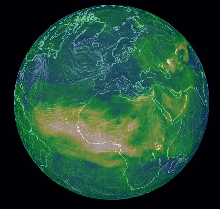
Screenshot of dust concentration on 5 January 2018 from Cameron Beccario’s weather animation tool. The tanner the color, the more dust.
Sometimes zooming in on a feature can be fun. Here’s an example of the Gulf Stream, a warm water current along the western boundary of the North Atlantic Ocean that hugs the east coast of the USA from Florida to Cape Hatteras. It’s because of this current that the Atlantic Coast of southern Florida often have warmer water than the Gulf Coast in winter. Beach-goers be aware!
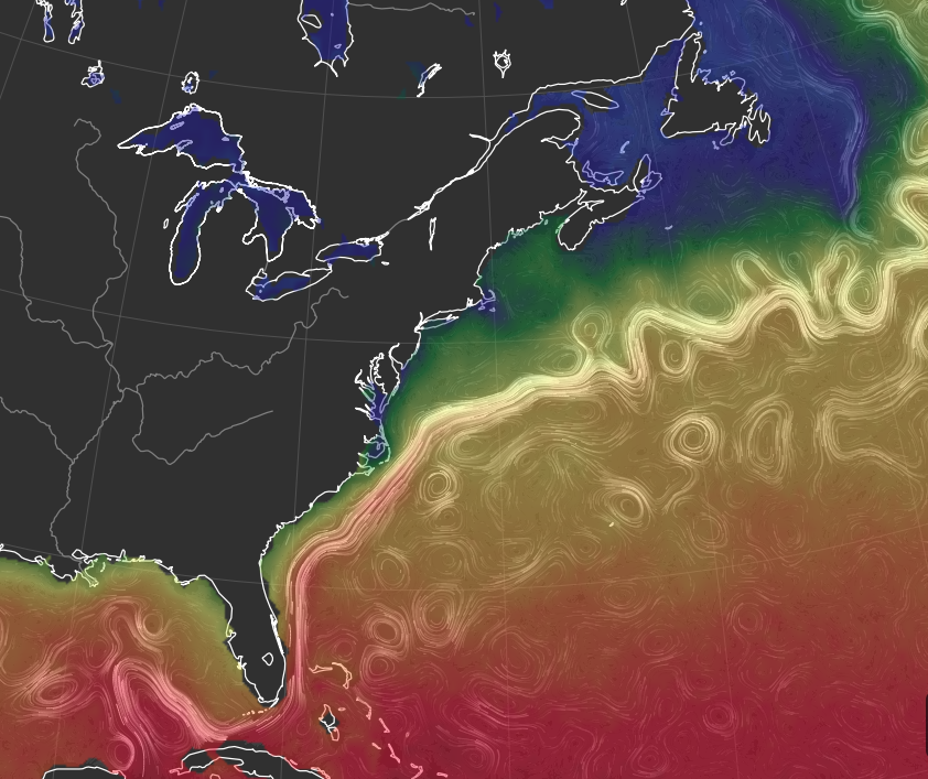
Sea surface temperatures and ocean currents on 5 Jan 2018 from Cameron Beccario’s weather animation tool. Red is hot; blue is near freezing.
Nice animations! Thank you for referencing this scientific artwork!
You might want to look into the NASA SVS site, too, for similar data visualizations (svs.gdfsc.nasa.gov). The NASA modelers are based at Goddard Space Flight Center, and produced, several years ago, an excellent ocean current animation called, “Perpetual Earth,” I believe. I don’t know anything about Mr. Beccario, nor his background, but he has certainly taken the NASA SVS work to another level, and interactive, too, which is a nice, and welcome, addition. Whether his treatment is as rigorous as that coming out of NASA, I will rely on you to tell all of us readers.
One of the troubles we all face is in the interpretation of the level of scientific rigor when presented with “fait accompli” mathematical simulations whose basis very few of us are qualified to assess. Parsing through reams of programming is the last thing most of us want to do, but we see ever more emphasis, across all the sciences, in the reliance on mathematical modeling systems that are mostly opaque, even if their results are beautiful to behold (I see that Mr. Beccario’s are for sale, btw). But, should we be using them in class, particularly if their underlying shortcuts, workarounds, and assumptions are unclear…?
Thanks for bringing this to our attention, Alex – excellent tool. I spent some time in the North Pacific this morning.
Hi Bill, that last paragraph is certainly a probing question. I’m not going to pretend to have the right answer, but I’m happy to share my opinion on how this sort of product should be used. I think it depends on the purpose of the presentation. Assuming the audience is a class (rather than the general public, like this blog), I am still comfortable sharing this sort of animation in the right context: namely, as motivation. To some degree, this is art. It’s cool. It’s engaging. If showing it can encourage students to make inquiries about the underlying data, ask questions about the ocean and atmosphere, think about the Earth as a dynamic system, then it’s worthwhile to use as a motivation tool before diving into the physics. However, I try to make distinctions with students between presentation tools and research tools. This is not a research tool, nor a predictive tool. Using it as the data for a lab or problem set would be inappropriate.
You might disagree with that assessment because, as you point out, there is opaqueness in an animation like this. Beccario doesn’t describe in depth everything he did to create it. However, he does share his javascript, so you could get independent verification of whether he’s making any shortcuts or assumptions that compromise the integrity of the data… if you can read the javascript.
Two things I find in favor of using the visualization despite the black box are:
1) At least in the broad strokes, I can verify that the information presented does match weather maps, radar, and remote sensing data from NASA, NOAA, and their European equivalents — organizations whose data I trust to be high quality. Indeed, Beccario is not claiming to provide any new data or analysis. He is not providing the science. He is providing the visualization of that science. I am not especially javascript competent, but he seems to be tapping into the data streams from NASA and co.; presenting their data but not providing any analysis of his. The “integration” I referred to in the blog post is that you can interact with data from multiple sources on the same visualization tool. Could we go straight to NASA instead? Yes, but the science behind the data would still be opaque to somebody unversed in atmospheric dynamics or radiation processes. There are still assumptions and shortcuts to converting the radiation captured at a satellite sensor to sea surface temperature. There are still workarounds and calibrations for taking a large swath of weather station snow and rain measurements and interpolating it to a map of precipitation. It is impossible to avoid all assumptions, and often those assumptions carry ambiguity and nuance that is beyond the scope of an undergraduate class. Does that mean the data should be avoided? I think not. However, I do acknowledge that sometimes we as teachers do not spend enough time highlighting uncertainty and assumptions in science with our students. I think the problem you present is a real one when showing any scientific data visualization.
2) The other thing that I do think is relevant to this particular case is that these are weather animations, which means we can and do test their accuracy and precision with regularity. People do love to complain about every time the “weatherman was wrong”, but in reality, our weather forecasts are darn good. There was a good article about weather forecasting improvements and how they have impacted the MLB in the Associated Press last summer: https://apnews.com/ddef161c08884774a87e17611c9170df. In other words, although many people disdain models, the integration of models with observational data is helping us improve weather forecasting, and there is no better test of a model than prediction and verification. Since Beccario is not providing the scientific data, the question of rigor goes back to NOAA, NASA, and the ECMWF. (The country outlines come from a non-profit, but those are a reference, not the essential atmospheric/oceanic science.)
That may go beyond what you were thinking when you brought up that point, but I think it an important one.
And for anyone else checking things out, here’s a link to the perpetual ocean, which I believe is part of the project Bill mentioned: https://www.nasa.gov/topics/earth/features/perpetual-ocean.html
The satellites used for that animation are mostly the same as those used for OSCAR (https://podaac.jpl.nasa.gov/dataset/OSCAR_L4_OC_third-deg), which is the source for the ocean currents in Beccario’s tool. I wouldn’t be surprised if the Perpetual Earth project and some of NOAA’s Science on Sphere datasets (https://sos.noaa.gov/Datasets/) were inspiration for Beccario.
Thank you for the incredibly in-depth reply–that was a lot of work!
I think my concern is that, as with almost all of modern technology, the “black box” is almost impervious to investigation, whether it’s the encryption of a WiFi signal, or the mechanics of the programming underlying fantastic animations like Mr. Becarrio’s (or those of NASA-SVS)–I had a hard enough time, long ago, debugging BASIC programs of a few hundred lines…. I worry about things like supervisory oversight, peer review, and qualified editors: the gatekeepers whose knowledge and depth used to “protect” the rest of us from true “fake news” and bad data. There seems to be little contemplation anymore, with lifestyles that have literally accelerated, in many cases, beyond human control.
By the way, another great set of animations along a similar, but somewhat less geologic, vein (i.e., science-based art), was in the December issue of Scientific American: “In Silico Flurries: Computing a World of Snowflakes.” Well, ice is, after all, a mineral. More beautiful computation based on crystal chemistry.
No need to respond, but I really do appreciate the lengths you went to in your first reply, above! I, and I’m certain others, appreciate the thoughtful response.
Hi Bill,
These are the types of discussions that make blog posts more rewarding, so I’m happy to reply. I may be overly optimistic, but I do think the system can work despite the acceleration of growing complexity in things like models and computer programs. If the peer review process is nurtured, and the right people (i.e., the people with appropriate expertise and low enough bias) act as gatekeepers, then I think we can achieve the needed level of review, vetting, and discussion of scientific research. However, I am not so optimistic as to think this system always works, and I agree with your concern that it is becoming less robust. As a young scientist trying to start a career, I know full well that the number of papers I publish, the impact factor of the journals I publish in, and the number of citations on those papers will be important measures to any review of my work. I also know that the number of papers I review, the amount of effort I put into those reviews, and the added value I provide from the peer review process is not weighed nearly as much. There is an incentive, therefore, for me to emphasize my own output at the expense of the greater good for science as a whole. There are hints that the review process is starting to evolve. For example, some journals are starting to record how many times you review for them, and there are some systems in place to collect that data with compromising the anonymity aspect of reviewing. If there are more numbers assigned to reviewing, it may be easier to give reviewing more weight in evaluations. I only just described a small step, though, and I don’t know whether other fields have better or worse ways of valuing peer reviews. Also, thanks for the Scientific American reference.