


The College of Wooster is now back in session for six more weeks, which means we have six more climate visualizations to share this semester. Today is bright, sunny, and quickly approaching 50°F in Indiana, Ohio, and Pennsylvania, but we’re due for a rainy week, so it seemed like a good time to highlight weather forecasts. In the USA, we see forecasts for our localities frequently. Maps or descriptions of current and future weather conditions are pervasive throughout the various forms of media, from phone apps to newspapers to radio broadcasts.
Below is the current weather surface according to The Weather Channel. There’s high pressure currently centered over the northeast — hence the clear skies, but a storm is brewing over the Oklahoma panhandle. Over the next few days, that low pressure center is going to move eastward and northward, shoving that precipitation you currently see over Missouri along with it and generating more along those fronts as it strengthens. I like The Weather Channel current surface maps. They’re neat, colorful, easy to read, and only show the essentials needed to understand the current weather state. However, they don’t have a similar map for forecasts.

For example, if you go to the “Classic Weather Maps” section of their website, and then scroll down to learn what’s in store for Wednesday, I you see this:

That not too bad for many people. Find a city near you, look at the symbol and the high temperature, and you get a good sense of how to dress. However, if you’re halfway between cities shown, like Wooster or the middle of Iowa or Oregon, this map is less helpful. Is is going to rain in Wooster like Cincinnati or just be cloudy like Detroit? Also, there’s a lack of context — there’s no marking of high and low pressure to help give a sense of the atmospheric circulation behind these weather forecasts. If you’re interested in your locality, you probably want a map that’s zoomed in further, so this national map isn’t helpful. And if you’re a weather geek, you probably want more detail. So this forecast map may not be what you’re looking for.
Another option is Weather Underground. This website is a bit geekier than The Weather Channel, and it’s especially cool that you can link up your own personal weather station data to their server for free and share it with the world. Their main forecast map for Wednesday morning (shown below) is dominated by the precipitation. No cities or cloud/sun symbols are shown, but you probably know where you live and can surmise that a place receiving that light green shade will be cloudy with some showers, whereas the dark green is a sure thing for steady rain at least part of the day. It’s a little easier to gauge the broader context here, too. That big band of rain from Texas to upstate New York is a classic signature of a winter storm (yes, “winter”… “extratropical cyclone” is more accurate, but also less commonly said) that’s moved across the Heartland and currently sits in the northeast, a big cold front extending down to the southwest. But the front isn’t drawn; neither is the low pressure symbol. There could be more.

Both The Weather Channel and Weather Underground are primarily weather communicators and collectors. They do not actually make the forecasts; rather, they receive forecasts from the National Weather Service (a branch of the National Oceanic and Atmospheric Administration, or NOAA). If you aim for Wednesday from NOAA, you get this map:
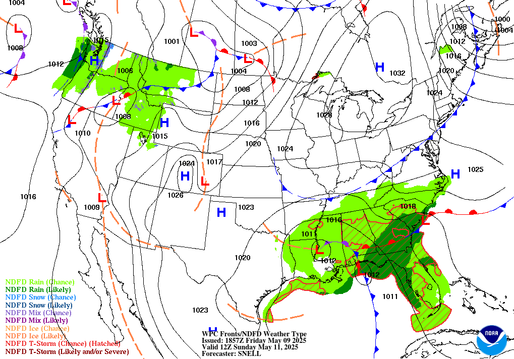
For the weather geeks, this is the best map. It has the precipitation forecast, but it also shows the fronts and the pressure. The context that can be inferred from other maps is plain and explicit here. This is definitely not the prettiest map, and if you’re not a weather fan, it might seem pretty cluttered. However, if you like clutter, check out this forecast map from Unisys:

Personally, I think that is not a nice color scheme, and the number of “Highs” and “Lows” indicated is a tad excessive. But there’s a lot of data on this map, and that can be useful for analysis even if it fails at communication. In the end, the map you choose likely depends on your personal preference!