


While Dr. Wilson is away on leave this semester, I am going through 15 weeks of “Climate Monday”, in which every week I get the opportunity to highlight one graphic or animation or data tool that shows something interesting about climate (and weather). I’m also using these tools to share a little climate science. Last week I highlighted a weather animation tool, so this week is fully in the realm of climate with NOAA’s animated Keeling Curve (also on youtube).
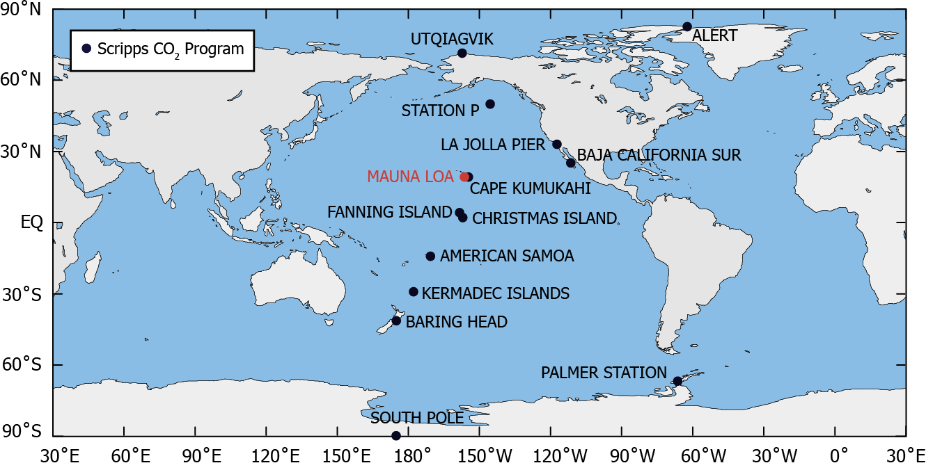
The Scripps carbon dioxide program, including the Mauna Loa Observatory. (Image Credit: Scripps Institution of Oceanography)
Humans have decades of direct observations of carbon dioxide concentration in the atmosphere. The longest continuous record dates back to March 1958, when C. David Keeling started analyzing air at the Mauna Loa observatory in Hawai’i. Mauna Loa is a good place to make such measurements because Hawai’i is isolated from major industrial regions like the Midwest of the USA, the Ruhr Valley in Germany, and the Pearl River Delta in China. There is relatively little regional pollution (although there is some from cities like Hilo and Kona, and from nearby islands like Oahu and Mau’i). The composition of the air in Hawai’i is a better reflection of the Earth’s average atmosphere than measuring, say, at LAX or O’Hare. Atmospheric measurements have been made up on Mauna Loa ever since.

The Mauna Loa Observatory (Image Credit: Theo Stein, NOAA)
The resulting data is the Keeling Curve, which is plotted below. The “sawtooth” pattern of the red line is the seasonal cycle of winter and summer in the Northern Hemisphere. In summer, plants take up carbon dioxide during photosynthesis, reducing carbon dioxide concentration. In winter, photosynthesis slows or stops throughout much of the Northern Hemisphere, and carbon dioxide can accumulate in the atmosphere. So carbon dioxide is always a bit higher in winter than it is the following summer. The black line has the seasonal cycle removed, so it shows the year-to-year changes in carbon dioxide. It also shows the increase from under 320 ppm in the 1950s to over 400 ppm today.
This is all really cool to seem but there is much more to our record of carbon dioxide than just Mauna Loa. NOAA has put together an animation that shows all of the dozens of other sites around the global that record carbon dioxide concentration and how that record has changed through time. It also puts that record in the context of paleoclimate. Seeing the whole animation, you can detect all of the nuance in the global carbon dioxide record. For instance, the Northern Hemisphere has a much stronger seasonal cycle than the Southern Hemisphere since it has substantially more land plants at mid and high latitudes. Other locales are even more variable, like many in the continental USA closer to major industrial centers. The South Pole generally lags a little behind the Northern Hemisphere, in part because it takes awhile for carbon dioxide emissions to mix throughout the whole atmosphere.